Posts

Ps HW3

Image
 I chose this image to be really difficult to edit myself in to because I would have to warp the green blanket to fit my face under them. It would be easy if I could just replace one of the faces with me in it though.  I chose this image as inspiration for my own Somewhere project because it has a bit of humor and its more in the background of the image. I plan on my project being funny, at least to me, and I feel like this was pretty funny and he is reacting to the image he put himself in.  This image made me laugh only because I know the person in the image. It also didn't help that the prompt on the first image has bad grammar. Its also a really like random image and the towel stands out quite a bit.  I have honestly thought about doing something like this so often. I find it so cool that a small object can look the same size as a big object if you warp the perception. 

BW to Color

Image
  For this assignment we were to take an image of ourselves connecting to the world or people. I chose to show how we can be in the world and connected to our lives but feel disconnected from people. I chose to do a pose that was zoned in to what was in front of my, or my world, and how I am completely blocked off from those around me.  For the colors of the assignment I decided to do bright colors mostly because they draw a viewer into the picture and often make them focus on those objects. The First option, Analogous, leaves me in greyscale while everything else is in color. This can more represent an emotion rather than a disconnection. For the second option, Square, the bright things are the items in front of my rather than everything around me. This could represent how I am mostly focused on those items since they are "my world." The last image I made it so that I was colored and the world around me was plain. This image looks as if I am in a box. closed off from the wor...

Ps HW 2

Image
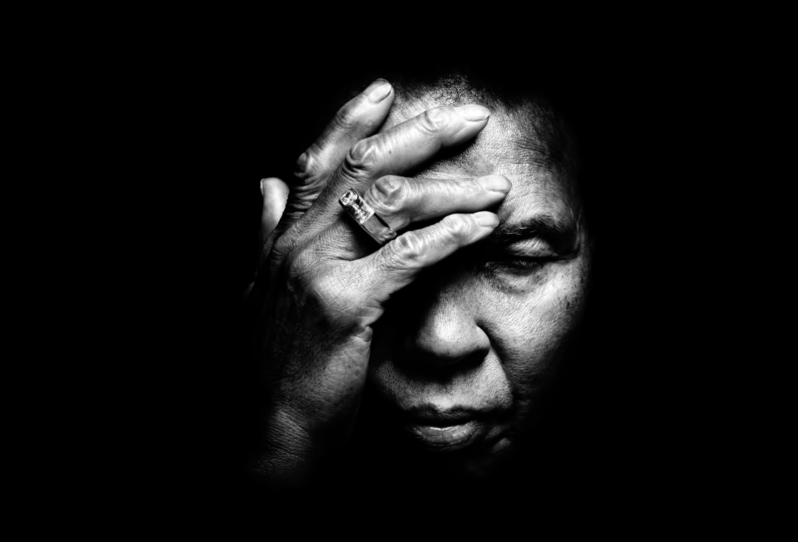
  I feel really connected to this image because I feel like I make this same expression almost every day. The person in this image, to me, looks tired. She looks like the exhausted tired where you would have been going and going for so long that you finally get a moment to reflect. I feel like every day of my life makes me feel like this image. I rarely get a second these days to fully relax with school, work, and planning my future. Even days where I get a moment to recuperate, it's usually me planning and preparing for the upcoming days. She looks tired, sad, and just in need of a break. The way her hand is on her forehead is like she is comforting a headache. It's a position I know quite well.  I like how the face is the only part of the image that is highlighted. It brings a closer connection to her and more intimate than if the was a background or more of her features present. The black and white removes any detail related to color as well which make it more emotional. Th...

Photoshop Tag Assignment

Image
  For this assignment we used our logos from a previous assignment to create our own artist tags. We used photoshop for the first time! The border of the flower makes it look like there is a break from the splash and the splatter. this allows the image to show its shape but allow the splash to encase the image. I chose that specific splatter because I feel that since my logo is a flower, it will be all around the image. It will make it look more street arty rather than smeared. The splatter looks purposeful rather than accidental. Overall, this is image is really nice for future use as it be a great way to claim all of my pieces later on in this class. I look forward to incorporating this design in the future! 

PS HW 1

Image
Quick Selection Tool The quick selection tool selects a part of the image that is different from the rest. You can go back and subtract from the selection and you can add parts of it that are not connected to the bigger selection.  I feel like it will be easy to use but tedious simply because it does not get you the most accurate selection and you will have to go back and fix it. One thing I liked about the video is that as he is explaining the steps the camera zooms in on which function or what he is talking about. I really enjoyed this because it showed a more close up image of what he was talking about which made it easier to follow along. He is also showing what we can do if it doesn't end up the way we wanted it originally.  Marquee tool This tool is a fast and easy way to made quick selections or cut out a portion of your photo. There is a rectangular marquee tool and an elliptical marquee tool. I feel like this tool is very similar to the quick selection tool which mean...

Poster

Image
For this assignment we had to make a propaganda poster that inspired or talked about something of our choosing. I decided to go with a more humorous approach and copied the idea of the "We Want You" posters from the World War II era. I copied Uncle Sam's pose in the poster and used very similar words to promote my message. My propaganda message was "We want you to join club swim." I decided to do this because I am an officer for the club on campus and I aim always promoting it to others. I felt that this project gave me an opportunity to talk about the club but also practice in Illustrator. First, I wanted my poster to have more color than the inspiration. The Uncle Sam poster is a white background that takes up more of the space than the message and subject. I also wanted bolder colors involved because the other was lacking. First I made the subject, me, have a simple look which draws more attention to the message rather than the details of me. Then, I decided ...

Blog #4 LOGO

Image
 Artists Statement For this assignment we had to create our own personal logo. The first prompt we received was to create an image that we would be okay with being tattooed on our forehead. This through me thorough a loop. One, because I am scared of needles, and two, it would have to be a really good representation of me. I decided to sketch things that were meaningful to me and things liked. I began with a whale shark because they are my favorite animals ever and I connect with them and their lifestyle in a way. other images included my favorite flower, which has a lot of different meaning depending on the color, and scuba diving masks. I ended up going with the flower but we were able to incorporate a snorkel in the mask to show my passion for scuba as well. For the colors, I decided to go with red, blue, and purple. I chose the red color because its the type we have at home in my backyard. I ha...